
- homebiocase studyprocesstestimonials
.svg)
.svg)
hello@kochanski.design
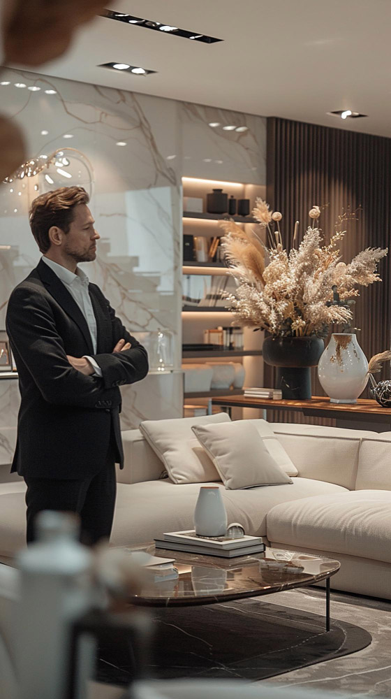
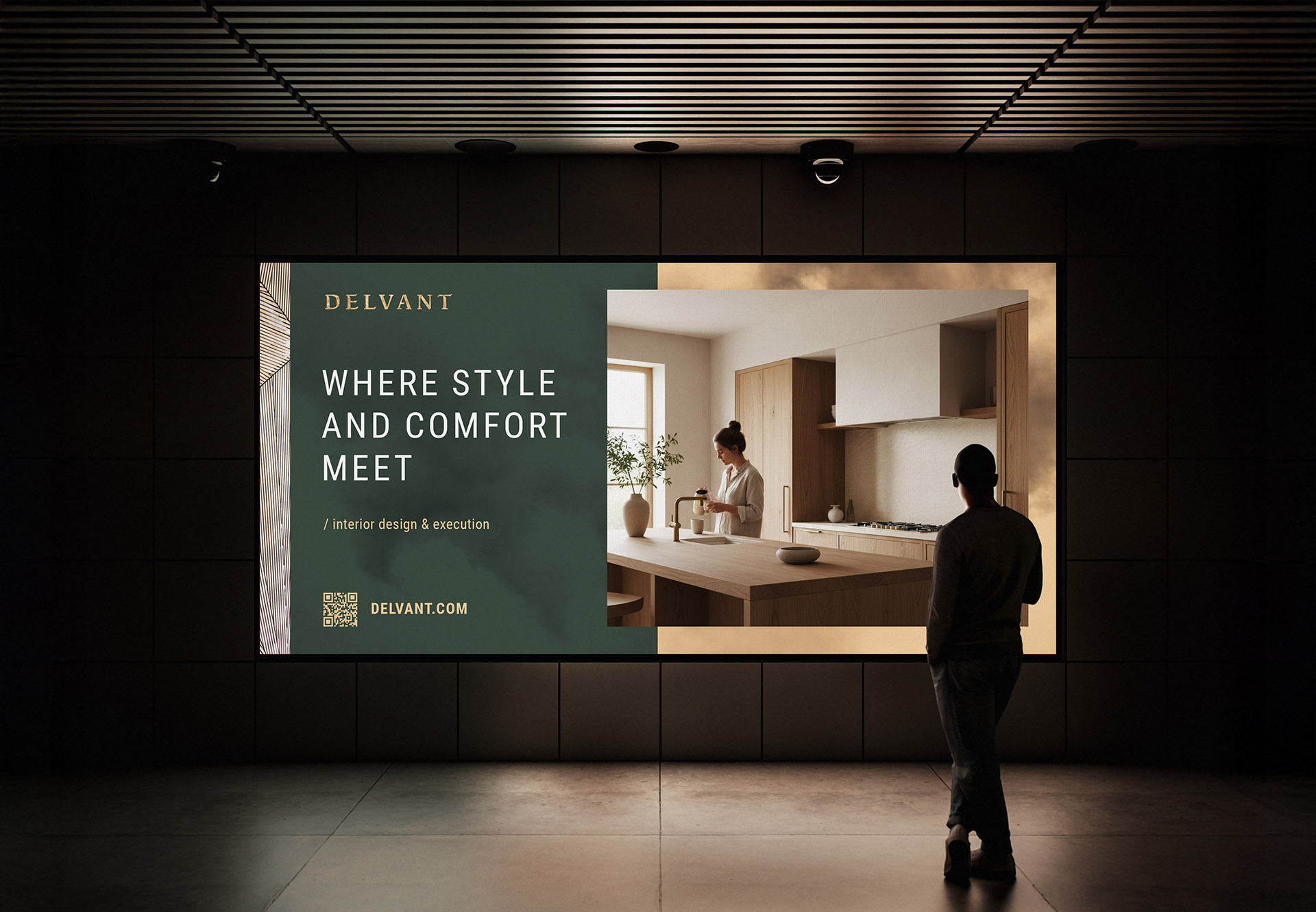
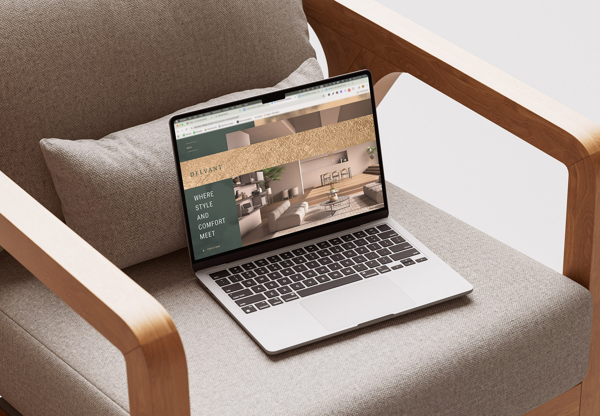
Delvant is a premium interior design and execution studio focused on high-end residential spaces.
to create a premium brand identity that communicates luxury without visual excess. delvant didn’t need a symbol or decorative mark. the logo itself had to carry the weight of the brand. the challenge was to design a typographic identity that feels timeless, confident, and expensive, while remaining calm and understated.
the client needed:
* a visual identity that felt premium and luxurious
* a system that could live on signage, digital platforms, and print
* a palette that's inspired by nature (loved that :D)
* a brand story that buyers could emotionally connect with
both, me and client, had the same taste and sense of style, so I could spread my wings
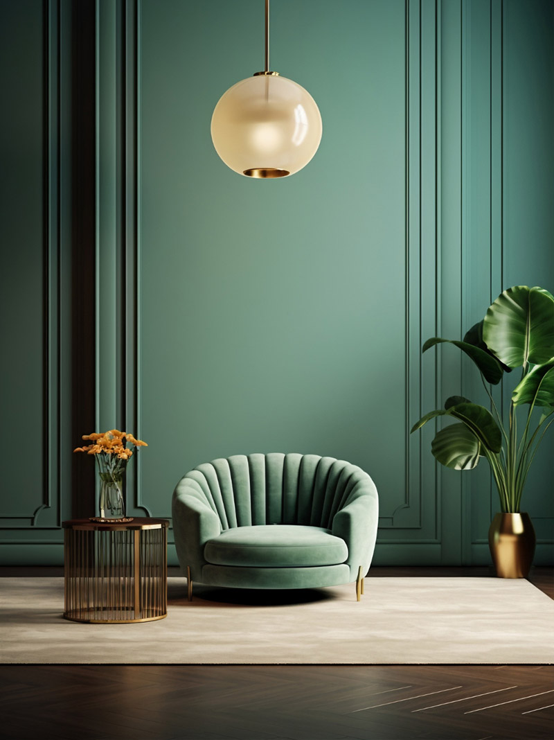
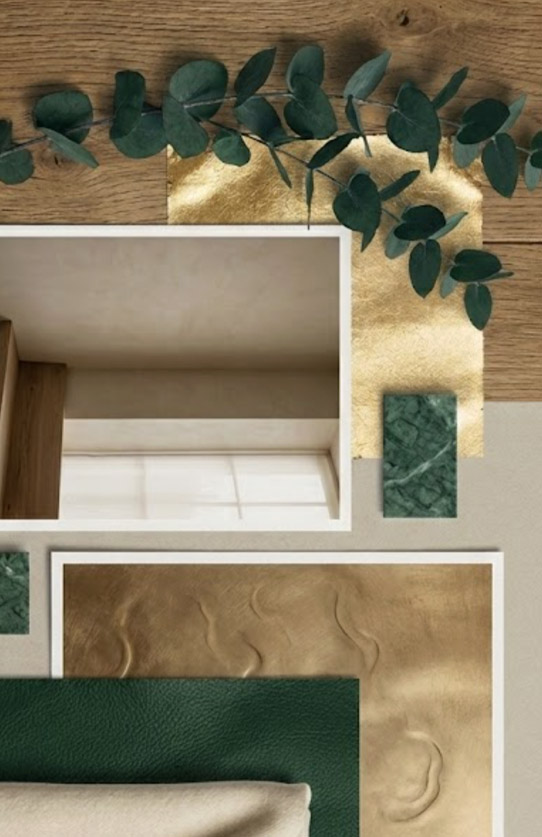
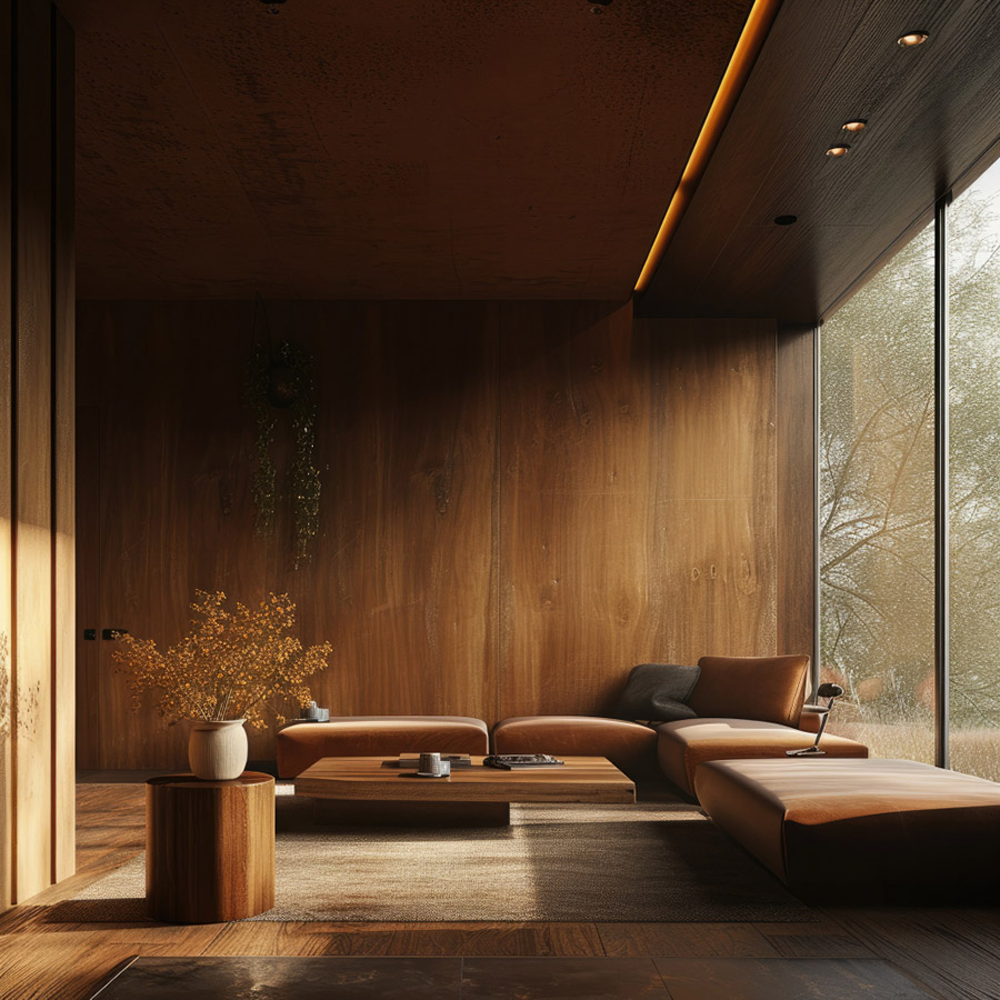
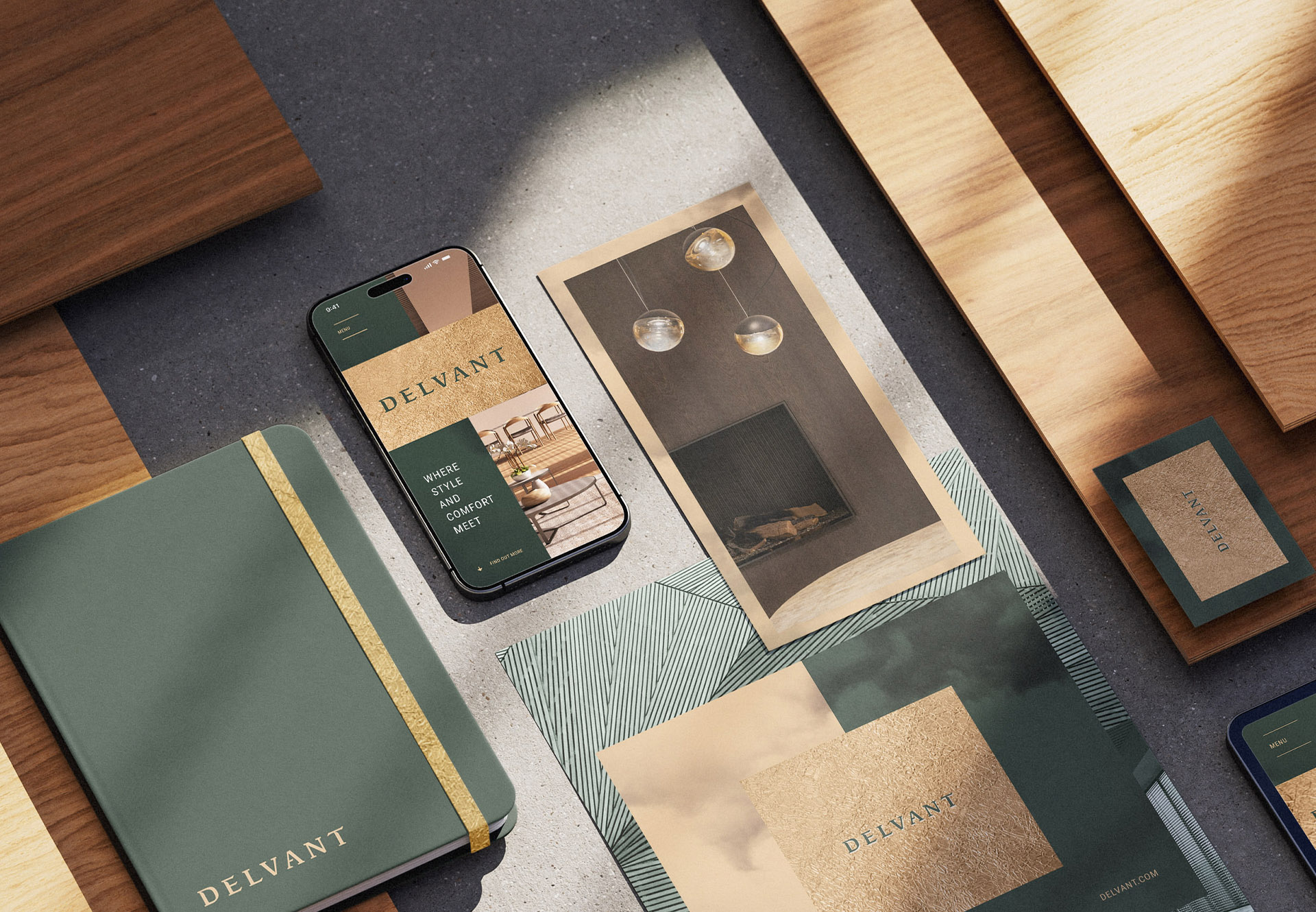
I started by defining Delvant's visual DNA:
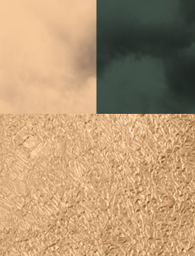
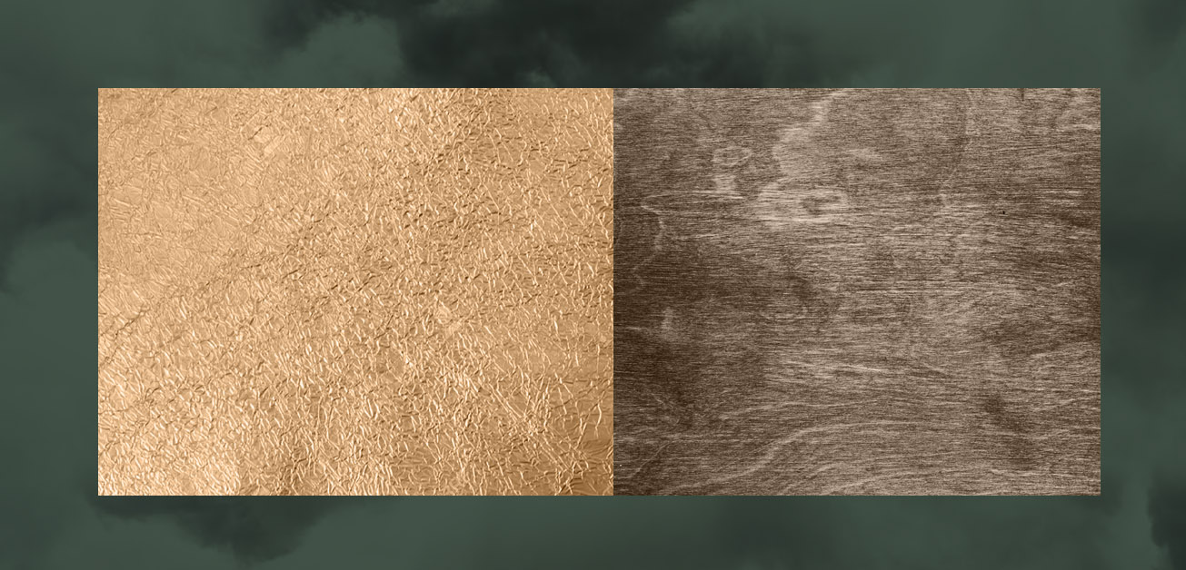
* natural wood textures
* a quiet, confident luxury tone
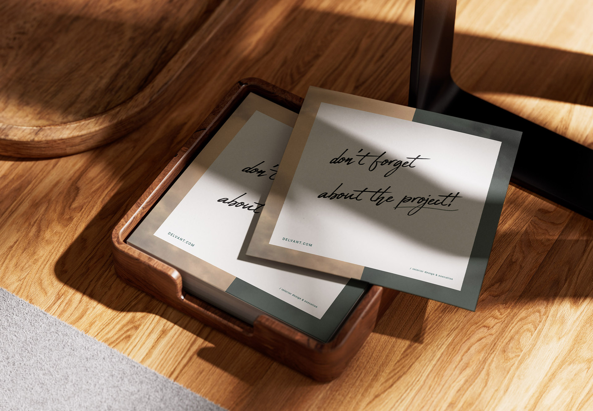
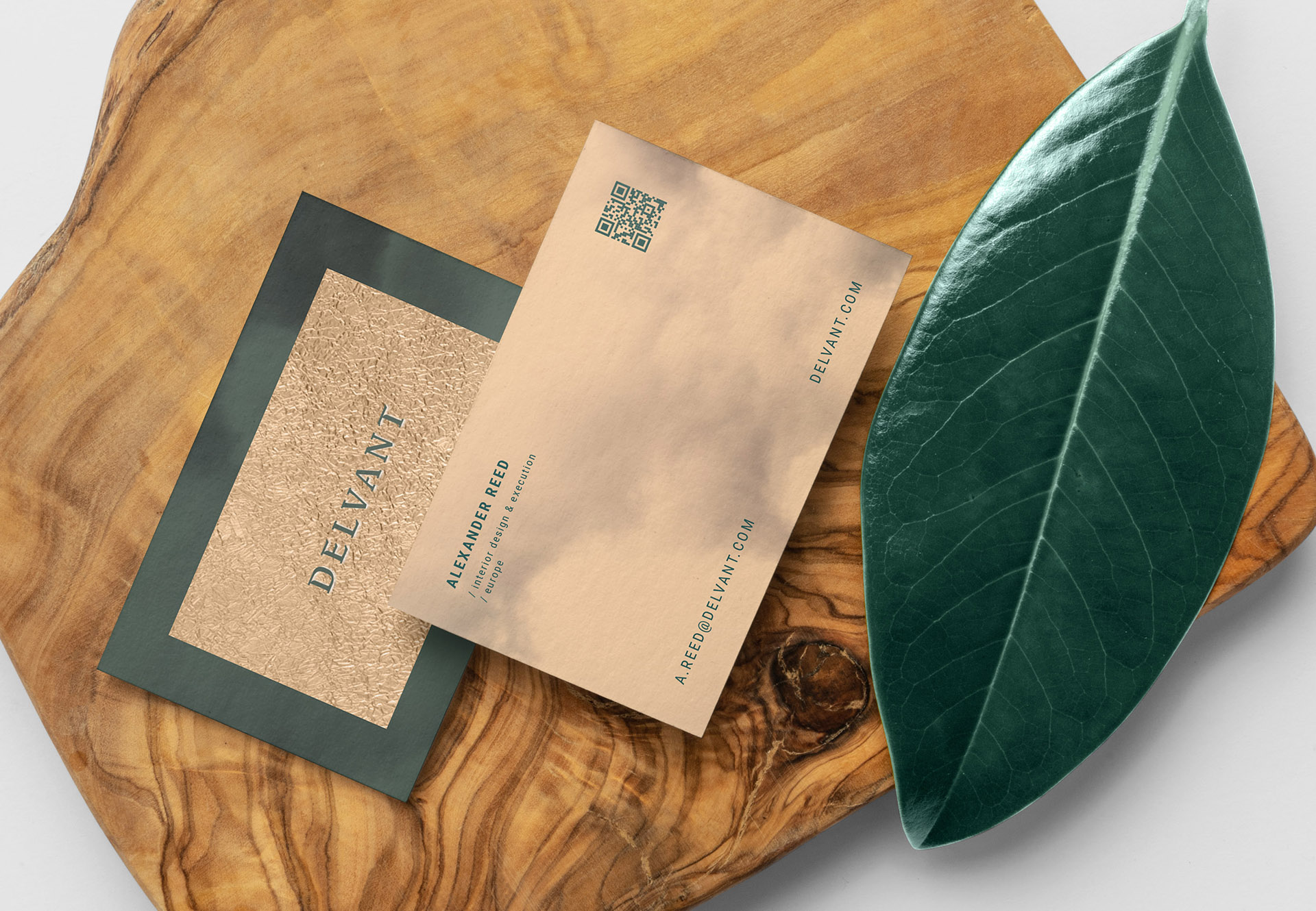
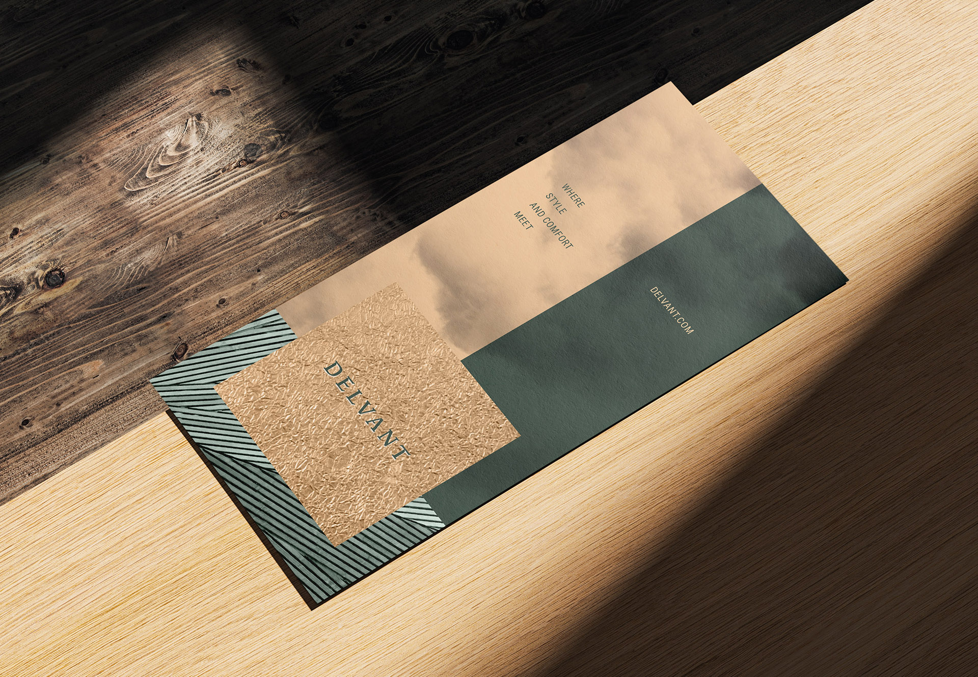
* textured gold foil, used to elevate print and physical applications
* calm, restrained compositions inspired by architectural balance
* quiet, structured emotional atmosphere
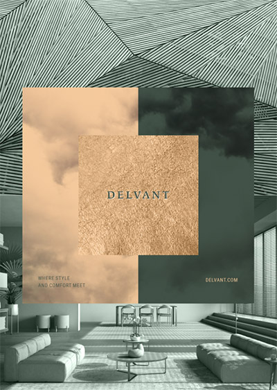
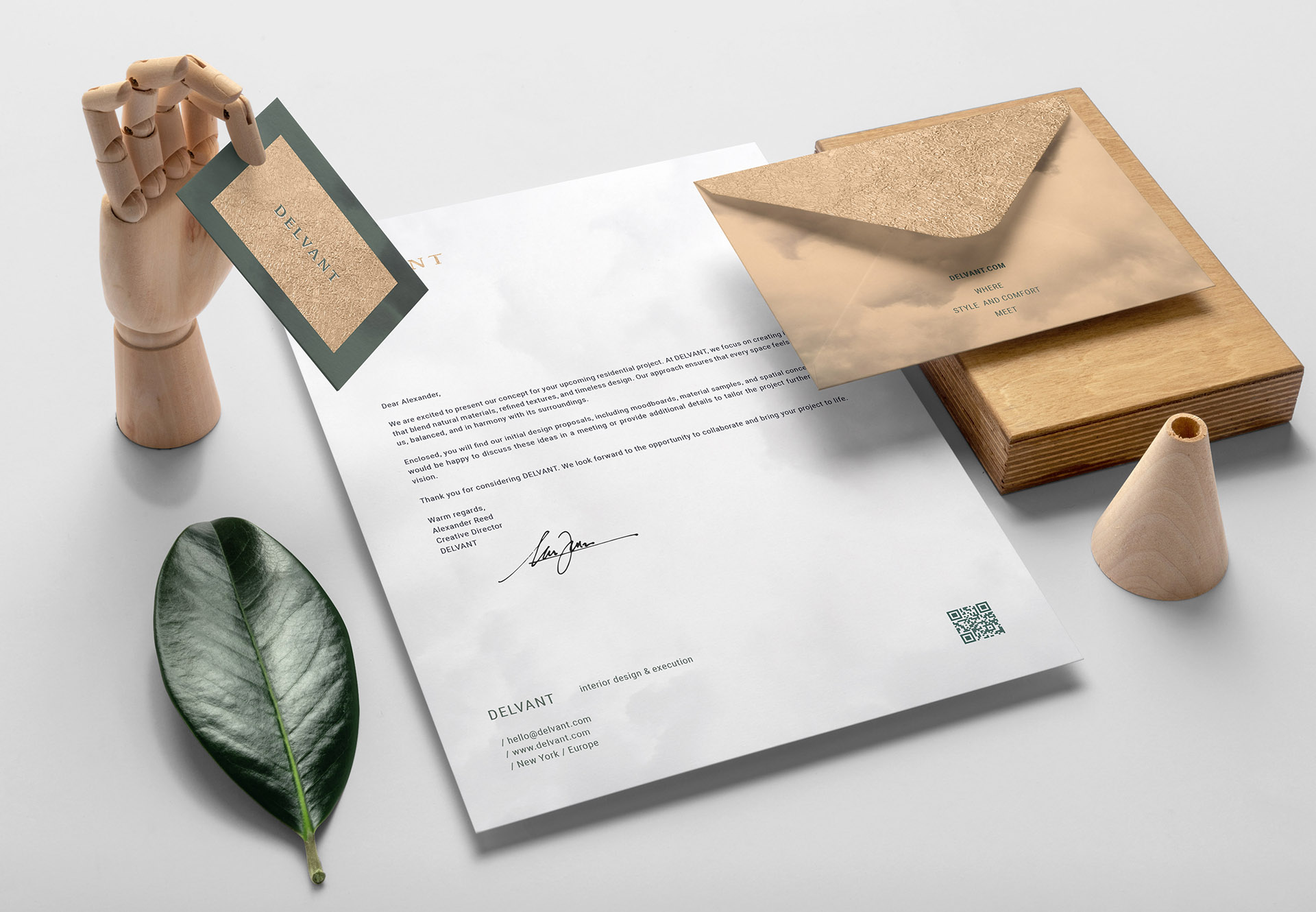
Using that, I built a direction based on:
* a refined, logotype-only identity with carefully crafted typography
* texture-driven visuals as the main storytelling element
* subtle contrasts between raw, natural surfaces and refined gold finishes
* a restrained color palette rooted in natural materials
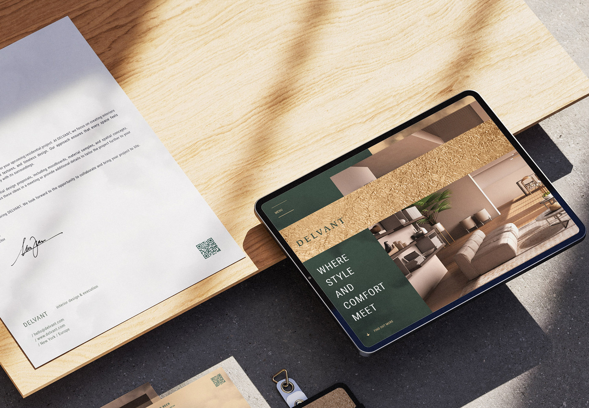
* a flexible system that works across digital, print, and physical touchpoints
understanding the brand, its values, materials, and the emotional direction behind Delvant’s interiors.
defining what makes the brand distinctive by focusing on texture, restraint, and quiet luxury.
exploring visual directions through sketches, material studies, and AI-assisted experimentation.
refining typography, proportions, and textures until the identity feels balanced and intentional.
translating the final direction into a consistent system ready for real-world applications.
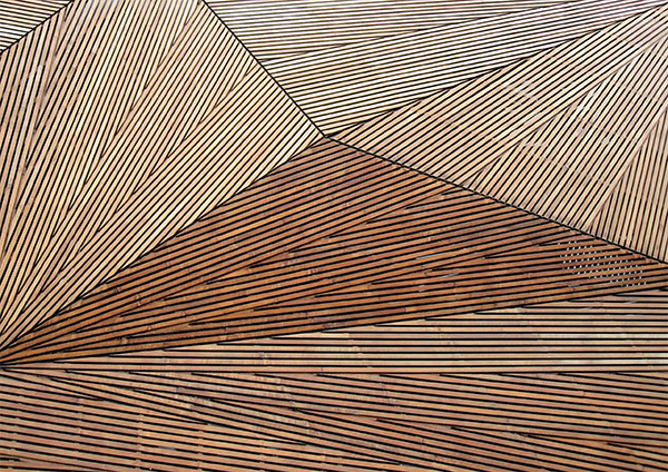
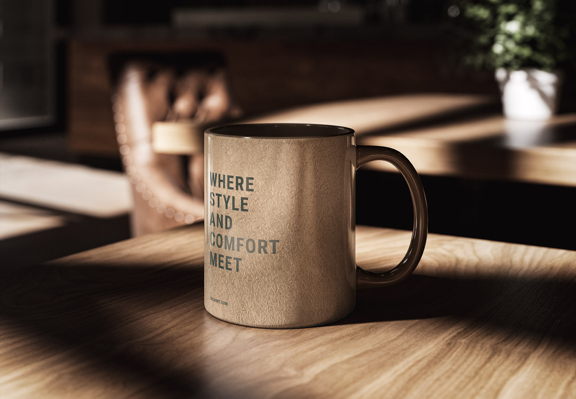
key elements include:
* texture-led visual language built around wood, gold foil, and organic surfaces
* calm, premium typography designed to feel precise and intentional
* minimalist layout system allowing materials and textures to lead
* subtle use of gold accents to elevate without overpowering
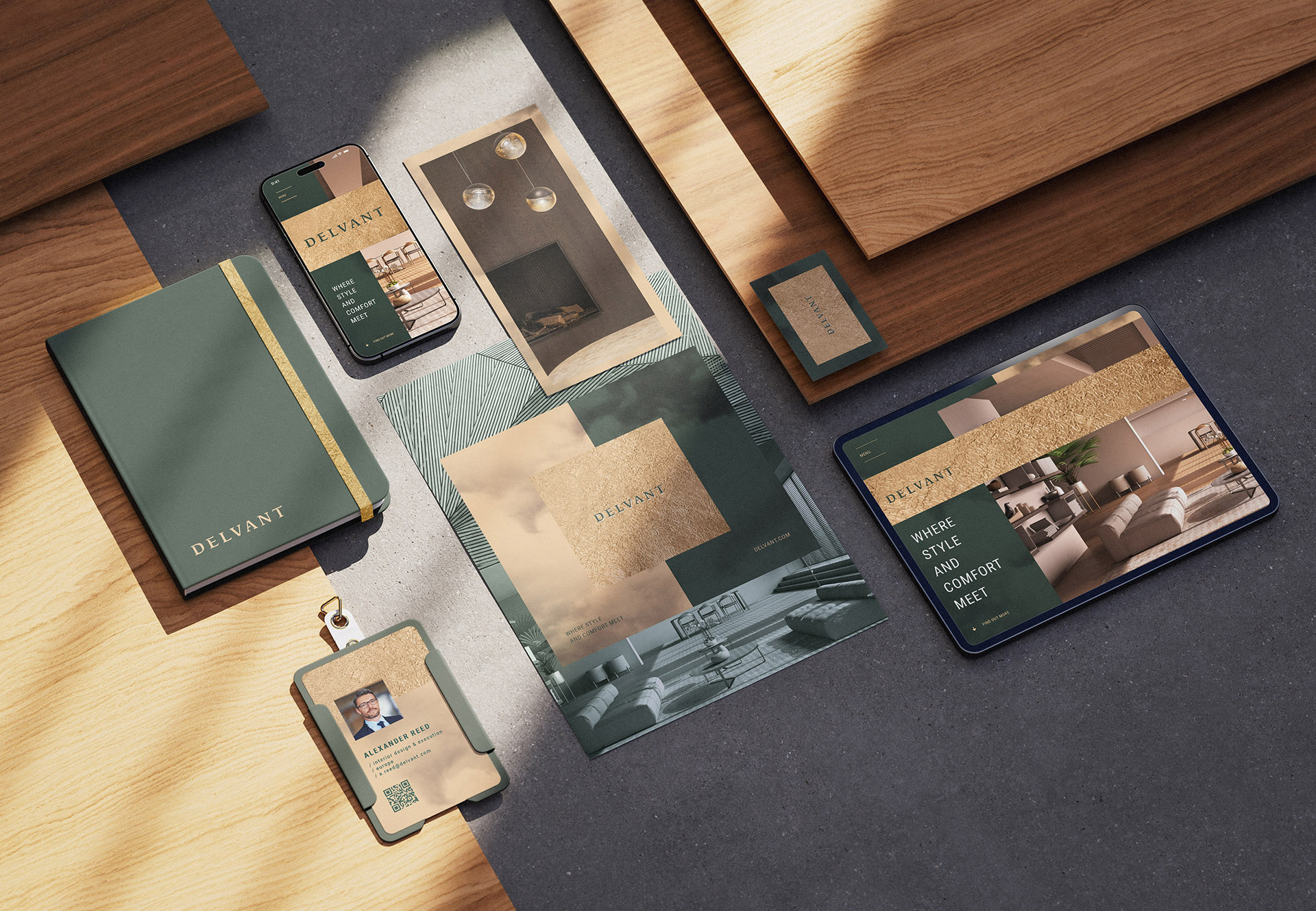
the identity feels:
* refined
* material-driven
* timeless
* calm and confident
* quietly luxurious
key elements include:
* muted, heritage-inspired color palette referencing concrete, stone, and natural patinas
* strong geometric typography for stability and trustminimalist grid system echoing the architectural blocks of Nowa Huta
* soft photographic direction with human warmth and natural light
* signage pattern grounded in simplicity
the identity feels:
* trustworthy
* structured
* rooted in place
* calm and premium
* emotionally subtle

if you’re ready for a brand
that feels intentional, emotional,
and truly yours, I’m here
hello@kochanski.design


C2025 kochanski.design