
- homebiocase studyprocesstestimonials
.svg)
.svg)
hello@kochanski.design
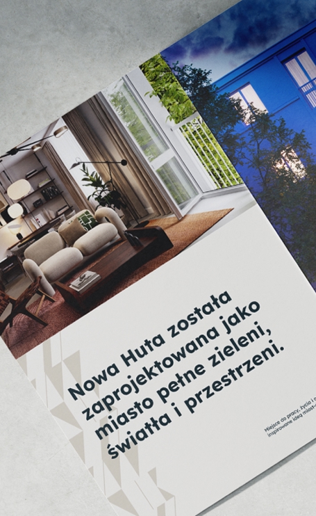
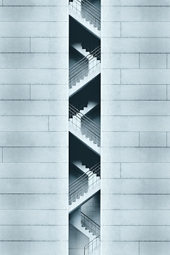
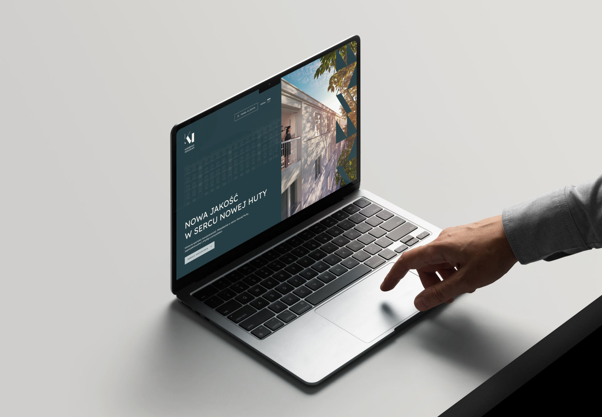
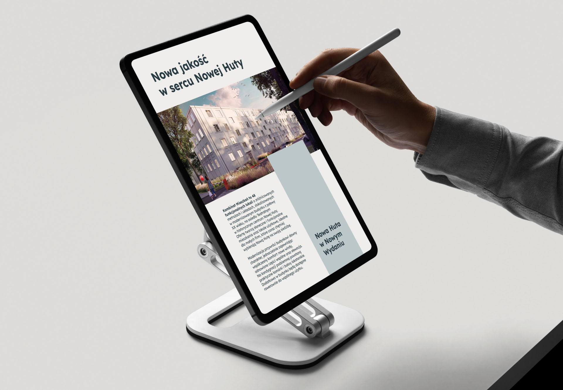
Kombinat Mieszkań is a residential development located in Nowa Huta, Kraków defined by its unique urban history, raw geometry, and strong architectural rhythm.
create a distinct, attractive brand using intentionally "quiet" colors inspired by Nowa Huta’s architectural past without losing modern appeal or market competitiveness.
the client needed:
* a visual identity that felt premium, but not luxurious or loud
* a system that could live on signage, digital platforms, and print
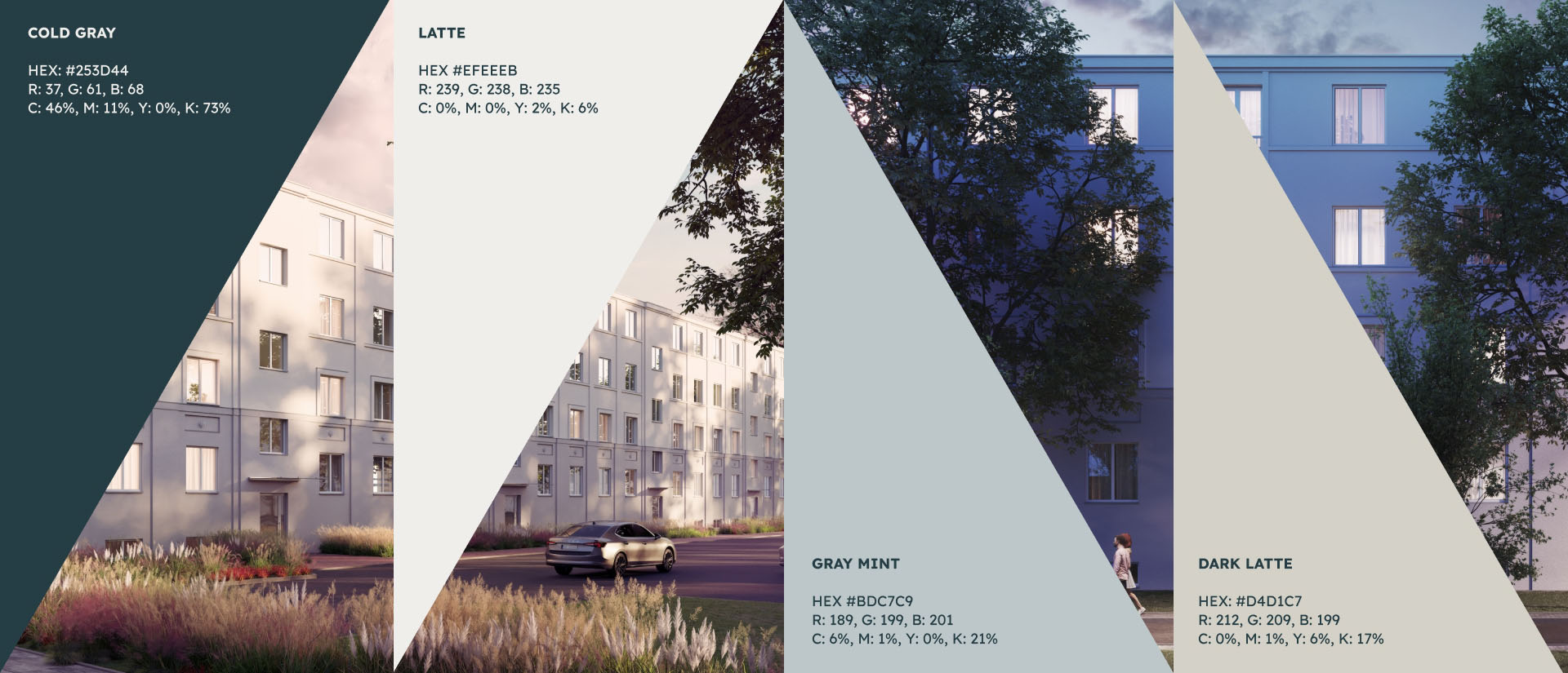
* a palette that referenced Nowa Huta’s muted, industrial elegance
* a brand story that buyers could emotionally connect with
this was a branding problem where sensitivity mattered more than spectacle.
create a distinct, attractive brand using intentionally "quiet" colors inspired by Nowa Huta’s architectural past without losing modern appeal or market competitiveness.
the client needed:
* a visual identity that felt premium, but not luxurious or loud
* a system that could live on signage, digital platforms, and print
* a palette that referenced Nowa Huta’s muted, industrial elegance
* a brand story that buyers could emotionally connect with
this was a branding problem where sensitivity mattered more than spectacle.
I started by analyzing Nowa Huta’s visual DNA:
* geometric grid of the district
* concrete tones
* soft, desaturated color environments
* repeating architectural rhythm
* quiet, structured emotional atmosphere
Using that, I built a direction based on:
* color greys + soft natural neutrals
* architectural balance
* rhythmic layout structures
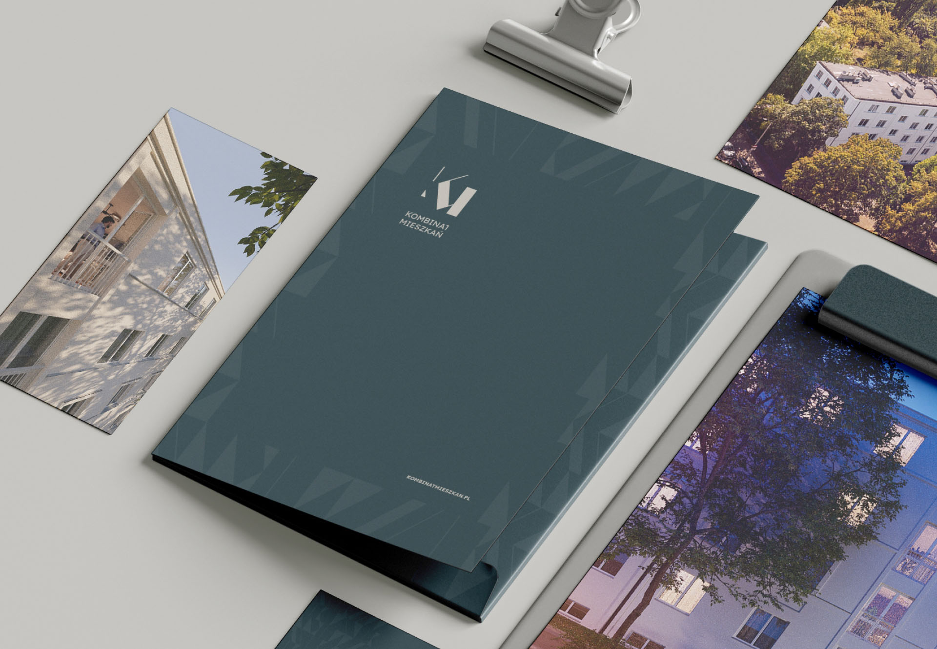
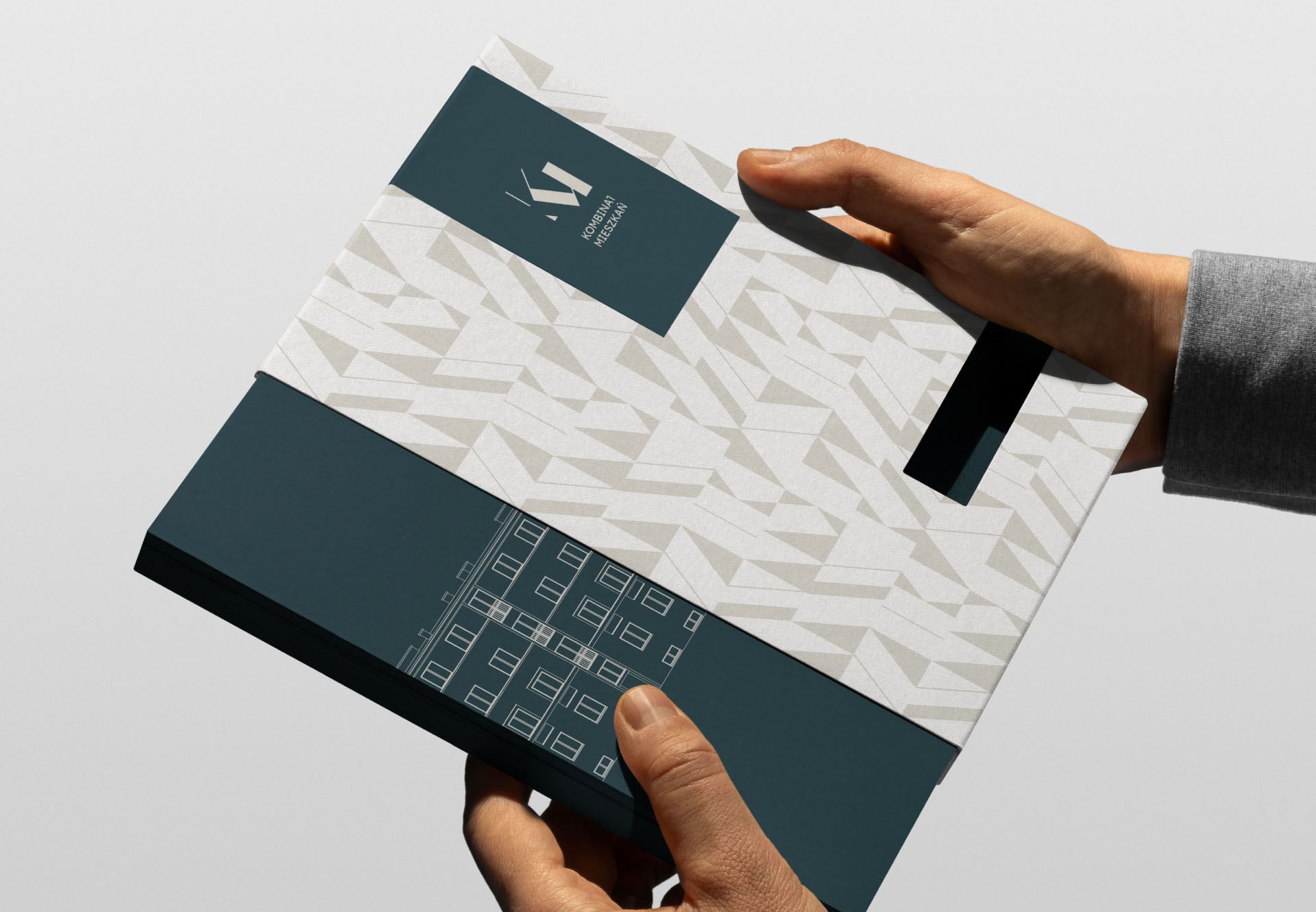
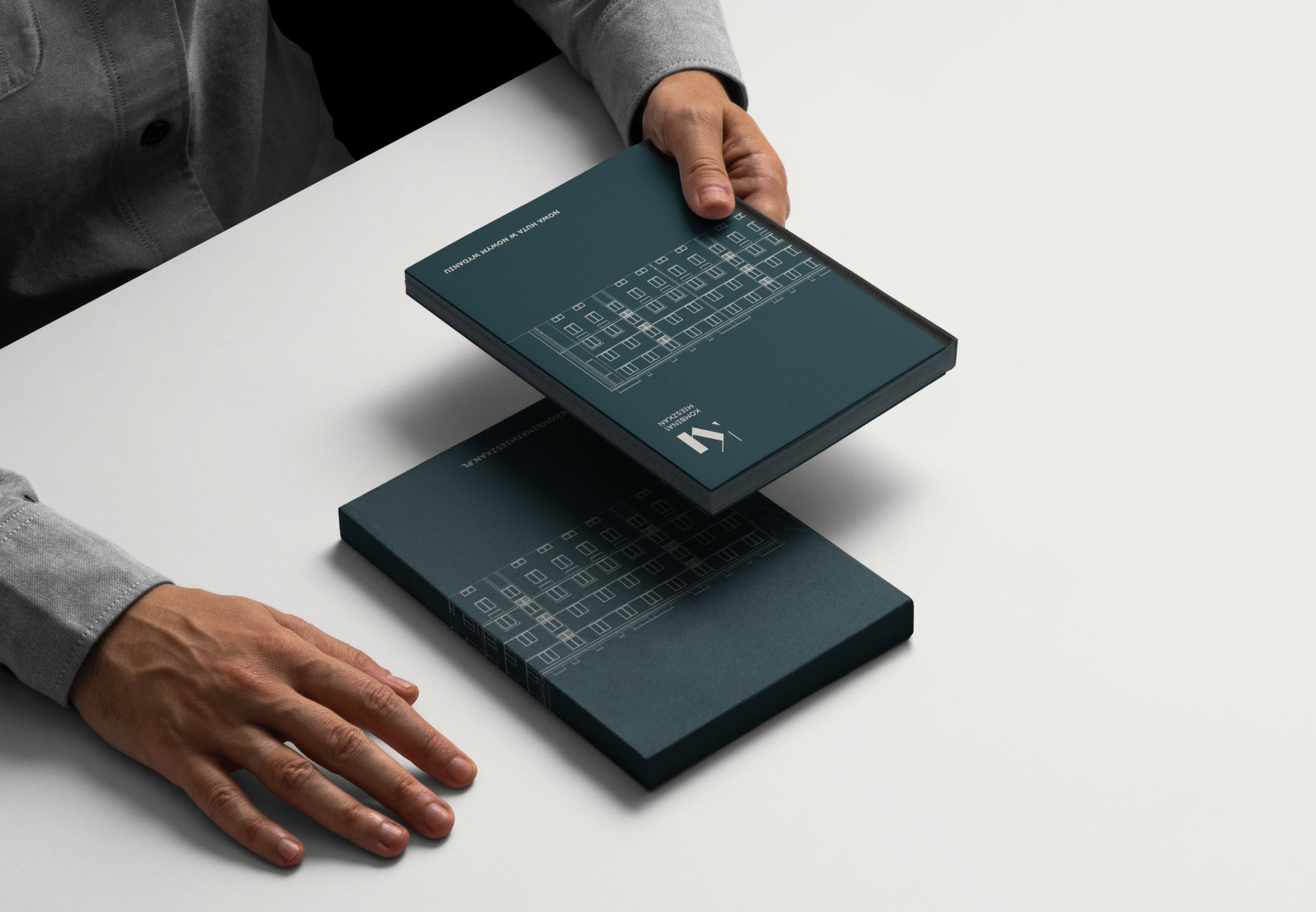
* clean typography with strong geometry
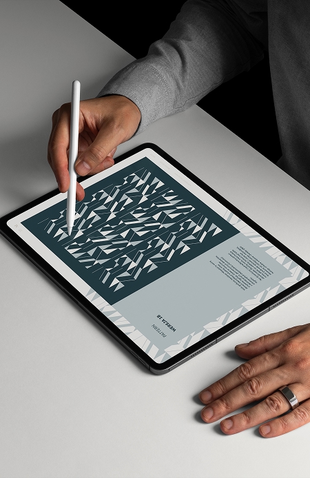
* AI-assisted exploration of color harmonies and facade-inspired patterns

i map the project’s goals, audiences, and constraints to build a clear, shared foundation.
analyzing architectural rhythm, textures, materials, and atmospheric qualities of the district.
i use intuition and ai-assisted exploration to generate bold, relevant concepts faster and with clarity.
i narrow the strongest directions, shaping structure, tone, and aesthetics into creative system.
i transform selected concepts into complete visual assets prepared for real-world use across platforms.
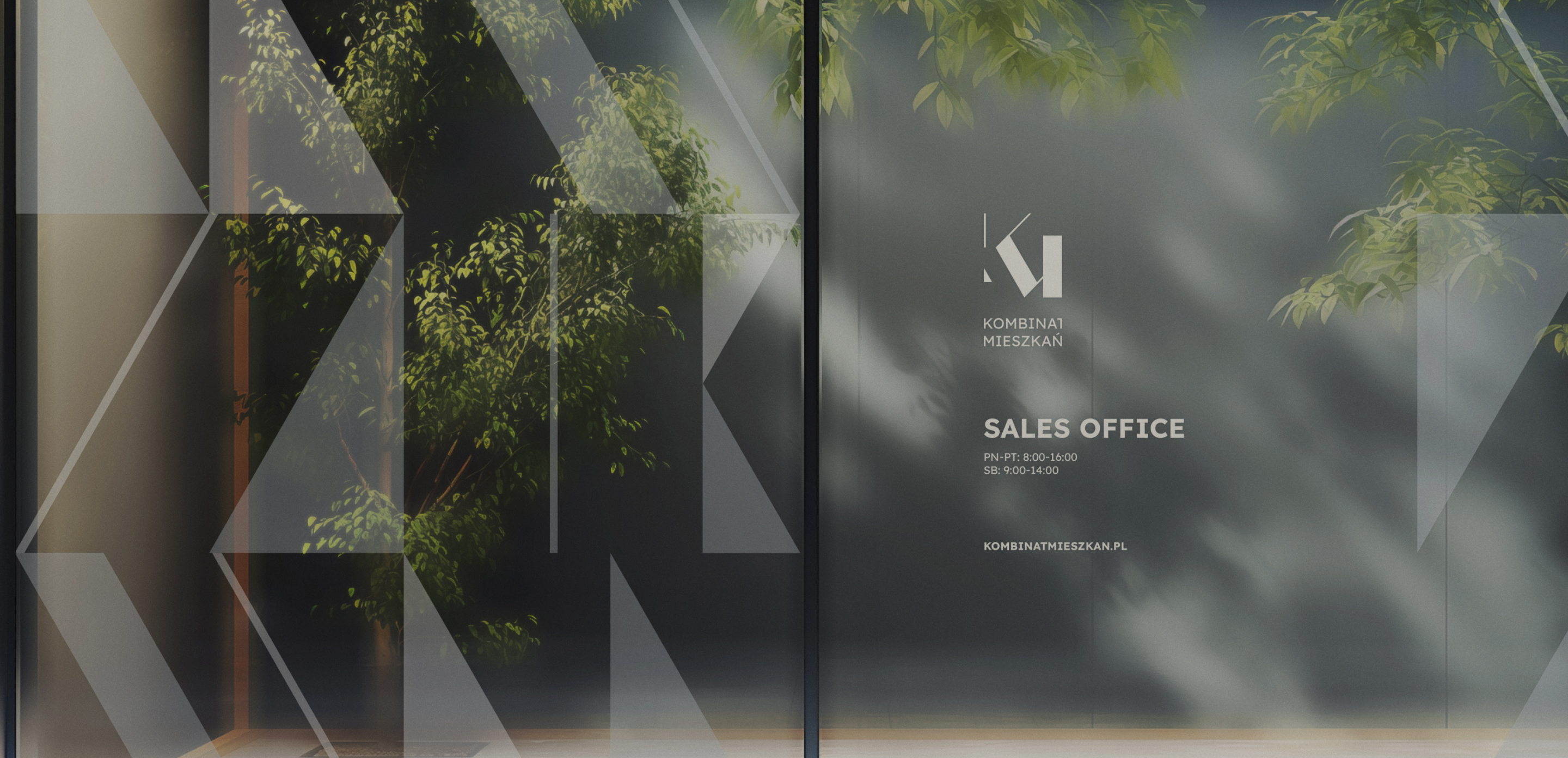
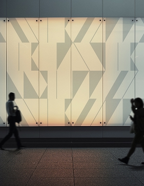
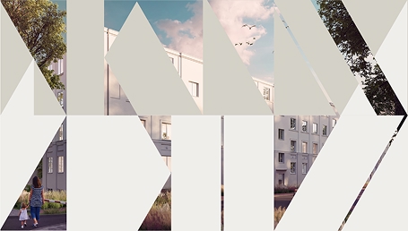
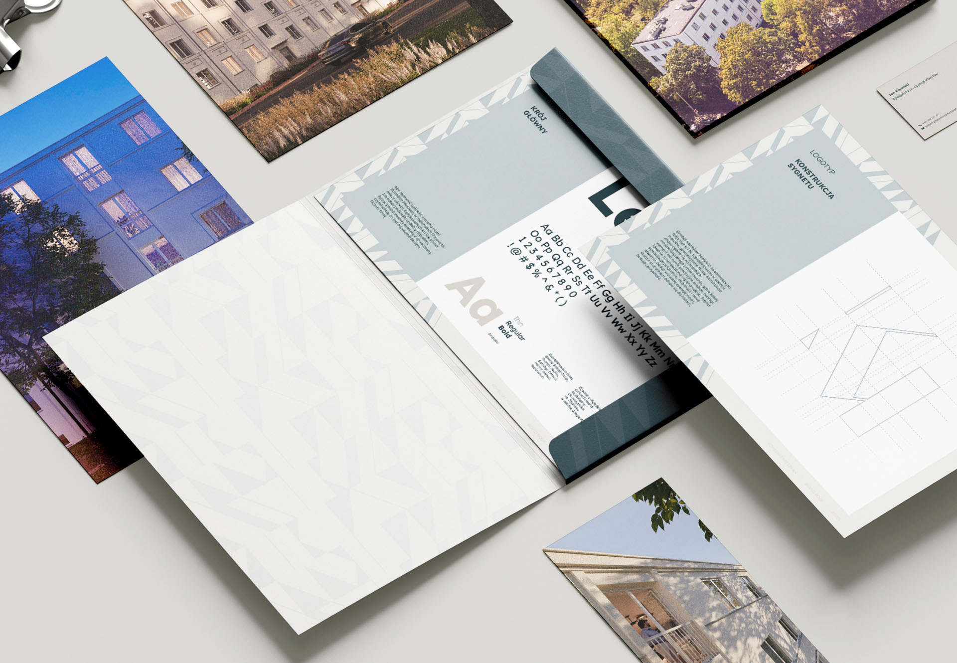
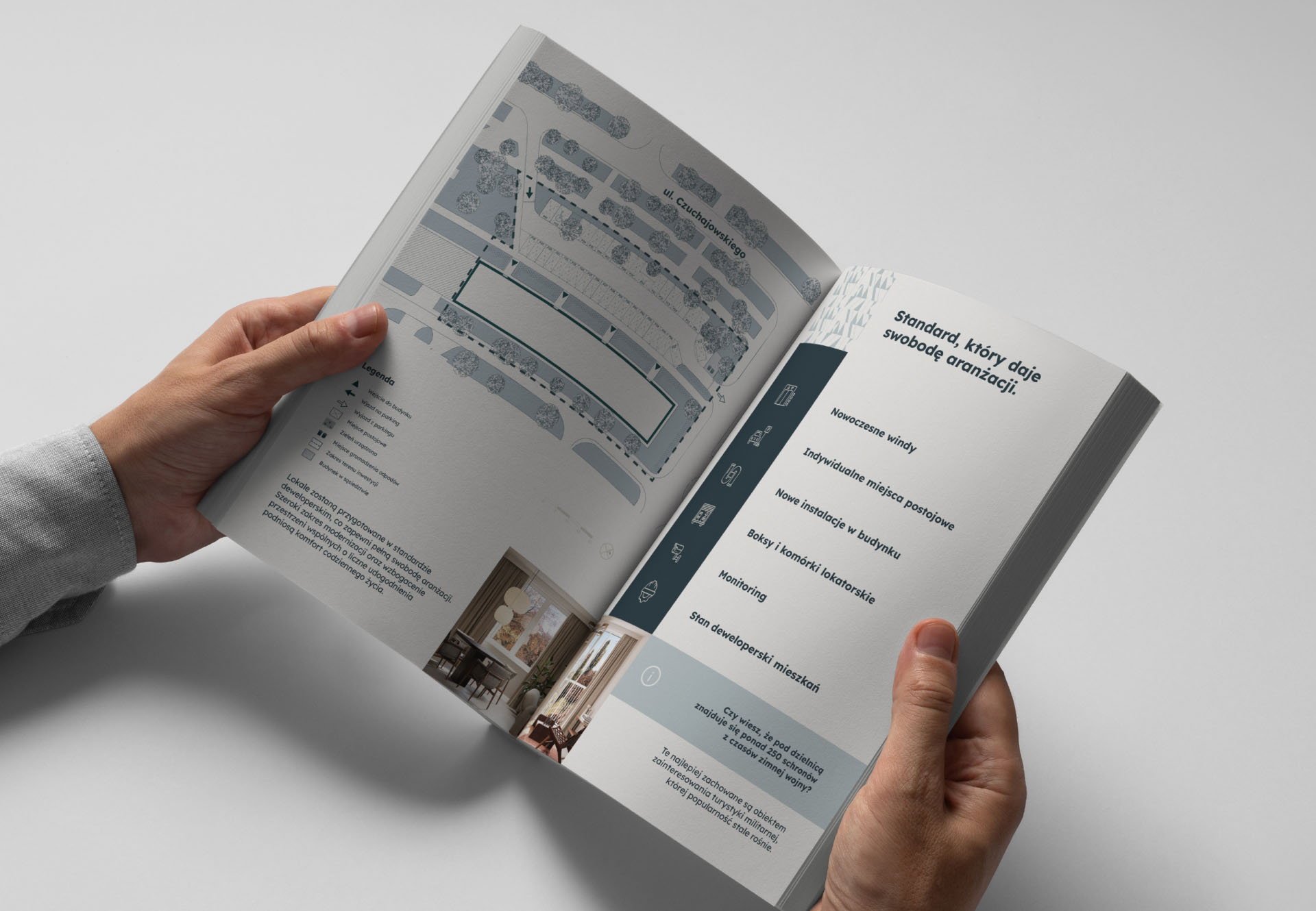
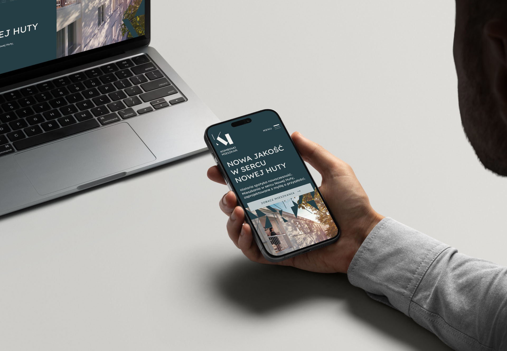
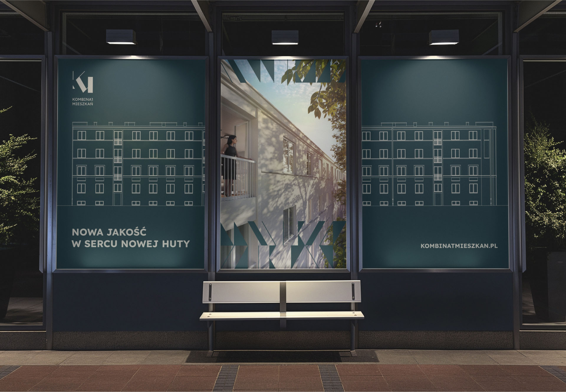
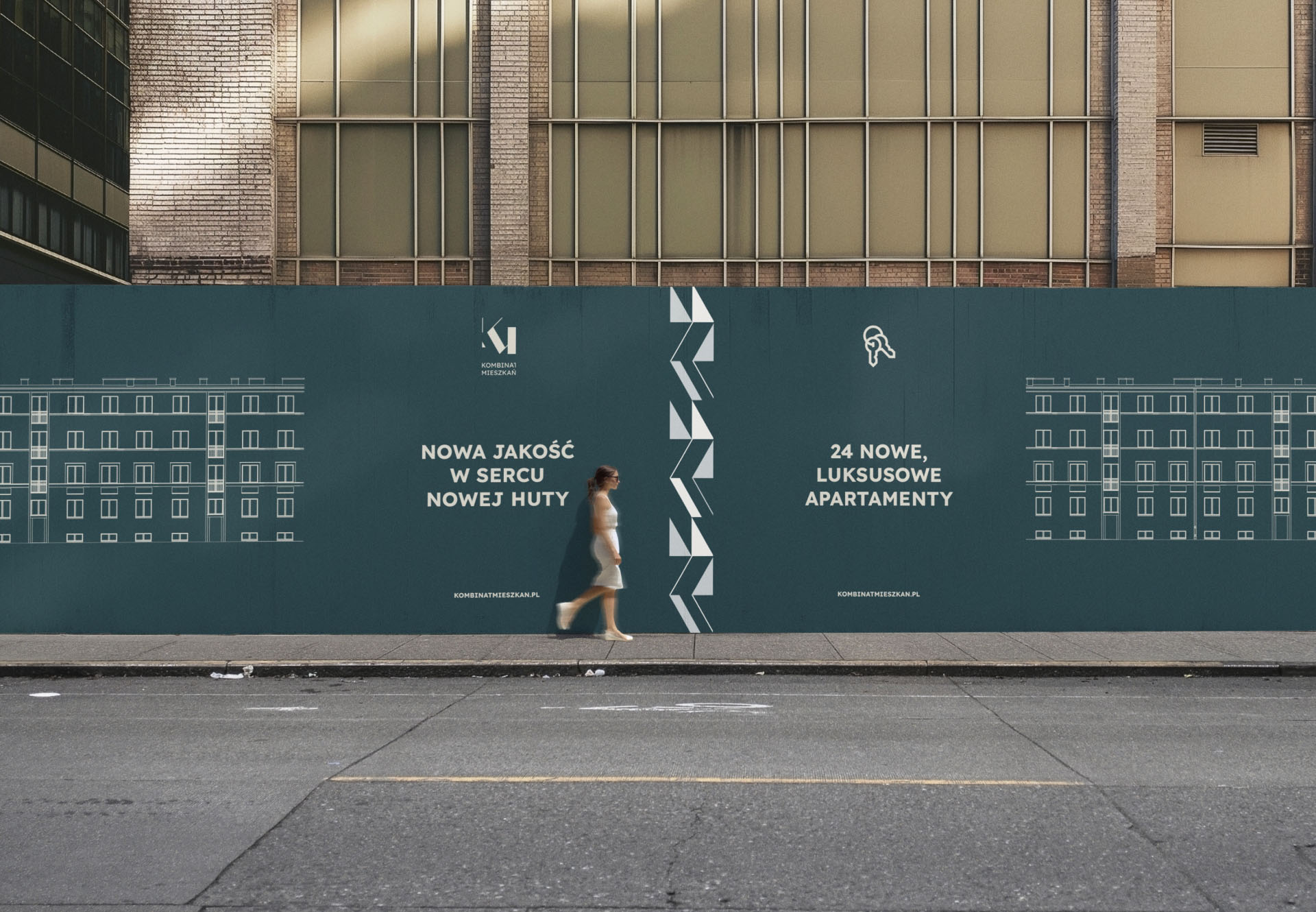
key elements include:
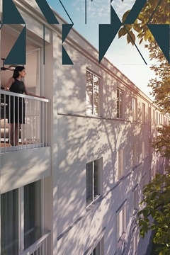
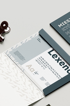
* muted, heritage-inspired color palette referencing concrete, stone, and natural patinas
* strong geometric typography for stability and trustminimalist grid system echoing the architectural blocks of Nowa Huta
* soft photographic direction with human warmth and natural light
* signage pattern grounded in simplicity
the identity feels:
* trustworthy
* structured
* rooted in place
* calm and premium
* emotionally subtle
key elements include:
* muted, heritage-inspired color palette referencing concrete, stone, and natural patinas
* strong geometric typography for stability and trustminimalist grid system echoing the architectural blocks of Nowa Huta
* soft photographic direction with human warmth and natural light
* signage pattern grounded in simplicity
the identity feels:
* trustworthy
* structured
* rooted in place
* calm and premium
* emotionally subtle
if you’re ready for a brand
that feels intentional, emotional,
and truly yours, I’m here
hello@kochanski.design


C2025 kochanski.design